
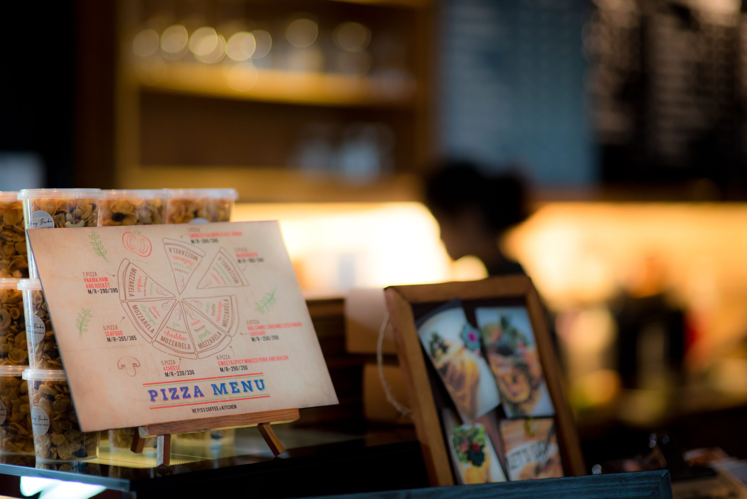
A menu does more than list what the kitchen can cook. Before a guest tastes anything, it establishes expectations about quality, price, effort, and even the kind of evening they are about to have. That makes menu design part of the dining experience, not a decorative job to finish after the food photography.
For a restaurant owner or chef, the practical question is not “How do I manipulate customers?” It is: How do I make the right choices easier to notice and easier to understand? A well-built menu maker can help you create a polished starting point, but the psychology comes from what you choose to emphasize, what you leave quiet, and how much mental work you ask a hungry person to do.
Menu psychology starts with attention, not persuasion
Diners rarely read a menu with the same concentration they would give a contract. They scan, compare, pause at something that sounds appealing, and return to the options that fit their budget or mood. That is why a menu can influence ordering without making a single exaggerated claim.
Research using eye tracking supports the basic idea that visual attention and choice are connected, but it also complicates the popular version of the story. In a study of 180 consumers, researchers compared a basic menu, a menu with sensory descriptions, and a menu with colorful nutrition graphics. Longer fixation was associated with choice in the basic and descriptive versions, while the nutrition infographic made choice less predictable. In other words, more visual stimulation did not automatically mean more control over the outcome. The full eye-tracking study on menu presentation and dish choice is worth reading because its conclusion is more cautious than most menu-design checklists.
My read is that the menu’s first job is to reduce friction. A guest should quickly understand the categories, identify a few plausible choices, and know what makes each one different. Design that calls attention to everything has effectively called attention to nothing.
Color: use contrast to create a hierarchy
Color affects what stands apart from its surroundings. A muted menu with one restrained accent can guide the eye toward a signature dish, a seasonal section, or a useful dietary marker. A menu covered in red, gold, green, and highlighted boxes creates a different result: every item competes for the first glance.
There is no dependable rule that red makes people order more, green makes food seem healthier, or yellow guarantees appetite. Those associations vary with culture, restaurant identity, lighting, print quality, and the rest of the design. A color that feels energetic in a quick-service restaurant may feel cheap in a quiet wine bar.
Use color for three jobs:
- Navigation: separate starters, mains, drinks, and desserts without adding more words.
- Emphasis: give one profitable or strategically important item a controlled visual distinction.
- Meaning: make dietary labels or seasonal markers easy to find, while keeping the legend obvious.
Color-coded nutrition information deserves special care. An eye-tracking study with 84 participants found that health logos and color-based labels affected food choices more than plain black-text calorie information, even though the label formats did not simply produce one universal attention advantage. That distinction matters: color can change how information is used, not merely where the eye lands.
Fonts signal price, place, and personality

Typography is read as atmosphere before it is read as language. A high-contrast serif may suggest ceremony and tradition. A clean sans serif can feel contemporary and efficient. A handwritten display face may add warmth, but it becomes a liability when guests cannot quickly distinguish a dish name from a modifier.
Font choice also shapes perceived value. Research summarized in the hospitality literature has examined font style, background color, and the physical weight of restaurant menus as cues that influence consumer perceptions. The sensible takeaway is not to copy a particular typeface. It is to make the typeface agree with the promise of the room.
Keep the system small:
- Use one display style for section headings or the restaurant name.
- Use one highly legible text face for dish names and descriptions.
- Reserve bold, italics, color, and capitalization for a genuine distinction.
- Check the menu in the actual lighting where guests will read it.
Descriptions do more than fill empty space. A plain “chicken with vegetables” gives the diner little to imagine. “Charred chicken thigh, lemon jus, and roasted fennel” gives the mind texture, aroma, and contrast. A 2021 study comparing rational and more emotionally evocative dish descriptions found more positive attitudes toward the emotionally described dishes, although that result should be treated as evidence about expectation and appeal, not proof that purple prose sells every plate.
Layout: the mythical sweet spot is less useful than a clear route
Restaurant advice often promises a fixed “golden triangle” where diners supposedly look first, then recommends placing the most profitable dish there. The evidence is not that tidy. A 2023 simulated-restaurant study with 13 participants found that the most-viewed area was the middle of the right page, but the researchers did not find a universal sweet spot and reported that gaze order did not determine purchasing behavior.
Another eye-tracking study found that price-conscious diners used different gaze patterns from other diners, and that menu layout affected how they processed information. This is a useful warning for restaurants serving mixed audiences: a luxury tasting-menu guest and a family comparing value are not scanning the same document in the same mental state. The hospitality research on menu gaze patterns and price consciousness explains why one fixed layout rule is unlikely to work everywhere.
Instead of betting on one location, build a route:
- Open each category with a clear heading.
- Put the most important choices where they can be compared easily, not isolated in a decorative box.
- Keep descriptions short enough that the eye can move from dish name to details to price without losing its place.
- Use whitespace to group related items and separate unrelated ones.
- Make the strongest visual treatment rare enough to retain meaning.
Prices change the emotional temperature of the page
Price is not a neutral label. It changes the question in the diner’s head from “What sounds good?” to “What is this worth?” When every item is aligned in a rigid column, the page can feel like a comparison spreadsheet. When prices are visually subordinate but still easy to find, the description and the dish itself may carry more of the decision.
That does not mean hiding prices. Opaque pricing damages trust and creates an unpleasant surprise at the end of the meal. It means deciding what should be read first. Use consistent formatting, avoid visual clutter, and do not let currency symbols, decimal precision, or decorative rules overpower the food descriptions.
The better test is behavioral: ask several people to find the cheapest main, the house specialty, and a vegetarian option without help. If they cannot do it quickly, the menu is not strategically subtle; it is simply hard to use.
What to test in a restaurant menu redesign
Menu psychology is most useful when it becomes a series of small experiments rather than a belief system. Change one variable at a time and watch what happens to item mix, average check, guest questions, and complaints. A new layout that raises orders but also produces more clarification requests may be creating revenue by creating friction.
- Test a descriptive version of a dish against a shorter factual version.
- Compare one accent color with a heavily color-coded page.
- Move a signature dish within its category while keeping its price and wording constant.
- Compare prices with and without decorative currency treatment, where local rules and customer expectations allow it.
- Measure whether dietary labels are noticed and understood, not merely whether they look attractive.
Do not claim a design worked because one busy weekend looked better. Compare similar service periods, keep the kitchen offer stable, and record operational factors such as stockouts, server recommendations, promotions, and weather. The menu is one influence inside a noisy dining environment.
The ethical line is simple: clarify, do not disguise
There is a legitimate opposing view here. Some operators argue that menu engineering is inherently manipulative because it uses visual cues to steer guests toward higher-margin items. That concern is reasonable when design hides prices, buries dietary information, or makes a less profitable option needlessly difficult to find.
I would draw the line differently: guiding attention is not automatically deceptive. A restaurant has limited space and must organize information. The ethical standard is whether a diner can still understand the choice, see the relevant price and dietary details, and order something they would recognize from the description. If the design only works when the guest misses an important fact, it is bad hospitality even if the sales report looks good.
A practical menu psychology checklist
- Can a first-time guest identify the menu sections immediately?
- Is there one obvious visual priority, or are ten items competing for it?
- Do the fonts match the restaurant’s price point and atmosphere?
- Can guests read the smallest text in the room’s real lighting?
- Do dish descriptions create a concrete expectation without making unsupported promises?
- Are prices, allergens, and dietary markers easy to locate?
- Have you tested the menu with people who were not involved in designing it?
- Are you measuring orders and guest understanding rather than assuming attention equals purchase?
Final takeaway
The most effective menu is not the one with the loudest colors or the cleverest psychological trick. It is the one that makes the restaurant’s best decisions feel obvious without making the diner feel managed.
Use color to create hierarchy, typography to set expectations, descriptions to make food imaginable, and layout to make comparison effortless. Then test the result against real ordering behavior. Menu psychology works best when it respects the person on the other side of the page.
How this article was put together
This article draws on recent menu and consumer-choice research, including eye-tracking work on 180 restaurant-menu participants, a study of 84 participants examining nutrition-label design, research on price-conscious gaze patterns, and a simulated-restaurant study that challenged the idea of one universal menu sweet spot. The evidence is stronger for attention, expectation, and information clarity than for universal color rules. Restaurant results will vary by cuisine, audience, service format, and pricing, so the recommendations should be validated with controlled menu tests rather than treated as guarantees.